This page is meant to document the problems I've encountered when trying to use the Adobe Garamond Premier Pro font to create, display and print texts written in ancient (polytonic) Greek.
The original online discussion can be found here
And thanks to very helpful input from Thomas Phinney I've finally understood the problem and described what I think is the right solution to it.
However, to help document the issue, I'm going to keep this page up and running for now.
To sum-up, under Mac OS X 10.4.7, when shown in that font, Greek capital letters bearing diacritical marks (I will often call them simply «accented» capital letters later on, though it's not an exact description) do not appear to carry diacritical marks in any application other than InDesign CS2. And even in InDesign CS2, it is all but impossible to obtain those letters by typing them into the document, unless they are immediately followed by a minuscule. E.g. Ὅστις will be fine, because the initial capital omicron with dasia and oxia is immediately followed by a small letter sigma and InDesign CS2, in this context, substitutes an accented glyph variant for the default unaccented glyph. But the simple relative Ὅ will be mangled and appear to have lost its diacritics because it's followed by a space.
What's worse, when importing an existing document, the results are not always satisfactory, as some Greek capital letters appear to lose their diacritical marks in the process, based on the same contextual variations.
In which case one must use the InDesign CS2's «Glyphs palette» to insert the properly accented glyph to replace the seemingly unaccented one. Or you can switch the text to another font that supports polytonic Greek, and you'll see those marks magically reappear.
It's only when displaying those characters using Garamond Premier Pro's default glyphs that the diacritical marks vanish.
Indeed, in Garamond Premier Pro, all the «default» glyphs assigned within the font to the Unicode codepoints which correspond to the accented Greek capital letters do not carry any diacritical marks. In other words, that «bug» is intentional. The font has been designed that way.
The problem is clearly linked to the treatment, via advanced OpenType features within the font, of the diacritical marks. Located on the left of the capital letters, those marks, when using Adobe Garamond Premier Pro, are simply missing from the default glyphs used to represent those characters. The font then includes additional glyph «variants» which carry the proper diacritical marks, but which are «invisible» and unaccessible to most applications. Even worse, those marks, when actually displayed and printed in InDesign CS2, are «hung» over the blank space before the letters, creating kerning and spacing issues and making the Greek text difficult to read.
I've looked inside the font using a demo version of FontLab Studio 5 and all the accented Greek glyphs, for small and capital letters alike, are apparently precombined (i.e. no combining glyphs are used). InDesign CS2, either via its Glyphs palette or in contexts where it considers that those letters should be accented (unfortunately it misses a lot of them), handles those characters correctly. But it's the only application that is able to [Update: Mellel for Mac OS X is apparently able to make use of some of the same contextual "features"].
QuarkExpress 7, for instance, though it is supposed to offer full OpenType support, is utterly confused by the way Garamond Premier Pro handles the accented Greek capital letters. It actually inserts two separate glyphs, one for the combining diacritical marks and one for the capital letter, when asked, via its Glyphs palette, to insert a Garamond Premier Pro accented Greek capital letter. One can then select or delete the diacritical marks and the capital letter separately. Which does not make sense at all, since the glyphs are apparently precombined and the font does not even seem to contain the needed combining glyphs!
Also, QuarkExpress 7 only recognizes the default unaccented glyphs as the desired Unicode codepoints, while the properly accented «variants» are recognized as incorrect codepoints that do not correspond to any known characters. On the other hand, InDesign CS2, in its Glyphs palette, lists the default unaccented glyphs and the properly accented «variants» as the same, correct, Unicode codepoints.
Note that both applications list all those glyphs with their correct and unique Glyph IDs (GID) within the font: it's only the corresponding Unicode codepoints that do not match, QuarkExpress 7 being obviously and hopelessly confused by the way Garamond Premier Pro handles those glyph «variants».
An example: capital epsilon letters with lenis (a.k.a. smooth breathing), GID 992 unaccented, GID 993 with the proper diacritical mark, both shown as Unicode 1F18 in InDesign's Glyphs palette, appear as GID 992 and 993 in QuarkExpress 7's Glyphs palette, which is normal; but then, in QuarkExpress 7, only the unaccented glyph (GID 992) is listed as Unicode 1F18, while the properly accented glyph (GID 993) is listed as Unicode E2B8, which does not correspond to any known character.
Inside the font, the glyph «variants» are indeed stored as Unicode codepoints E2A2, E2A4, E2A6 etc., which are located in a Unicode block reserved for «private use». The link between those «variants» and the default glyphs is established through their names. For instance, in the above example, GID 992, the default unaccented glyph stored as Unicode codepoint 1F18, is named «uni1F18», while the accented variant, GID 993, is named «uni1F18.init» and stored as Unicode E2B8.
InDesign, probably relying on some clever OpenType trick, is then able to recognize both the unaccented and quite useless default glyph as well as the properly accented glyph «variant» as representing the same valid Unicode codepoint, even though the «variant» is actually stored as a different «private» codepoint within the font.
But no other application, not even QuarkExpress 7, can do the same.
The way Garamond Premier Pro stores unaccented glyphs as the default versions of the accented Greek capital letters is clearly problematic. And it explains why one can't type those letters directly into any application, even InDesign itself if the capital letter is not immediately followed by a minuscule. When typing those letters, the operating system, by means of a keyboard layout, asks the applications, including InDesign, to insert the Unicode codepoint corresponding to the typed letter. And here InDesign, in many cases, is just as «dumb» as any other application, despite all its OpenType smarts, and inserts the default unaccented version of the glyph, not the properly accented one.
But pictures are worth a thousand words.
First, the «kerning» or «spacing» issue. Here is a screen capture of InDesign CS2 showing a sentence taken from Andocides' On the Mysteries. As you can see the word «Hermai» is too close to the preceding «hoi» because the diacritical mark is drawn over the blank space between the two words, using the default (metrical) kerning information stored within the font. The good news is that at least here, in InDesign CS2, one can see the rough breathing:
![]()
Here is the same sentence where the kerning has been modified to separate the two words. I may have added too much kerning, since I'm not a typographer, but even if +120 is not necessary, I'm quite certain that the default (0), that is, «use the kerning information within the font», is not enough in this case:
![]()
Last a screen capture of the same sentence in Microsoft Word: the diacritical mark has vanished!
![]()
Here are two more pictures to demonstrate how the problem affects the capital epsilon, this time using Herodotus as my victim:
![]()

As you can see, the capital epsilons run into the preceding letters, especially when accented with a double (i.e. wide) diacritical mark.
BTW, in this regard, Minion Pro, though it seems to use different OpenType techniques to achieve similar results, since its diacritical marks do appear in other applications, is just as problematic (maybe even more so):

You can download Herodotus' text using the following link in order to see InDesign CS2 and Garamond Premier Pro in action and play with the document: Herodotus.indd.zip
Here I quote Ralph Hancock's description of the problem, from a font designer's perspective:
Classical Greek, with its plethora of marks, does indeed require rather open word spacing, wider than would be considered necessary in a roman font. Consider, for example, the often found sequence (in visual order)
delta apostrophe space lenis capital-Epsilon
| [Here is that sequence using Ralph's Vusillus font:] | [Here is that sequence using Garamond Premier Pro:] |
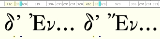 |
(Capital Epsilon with lenis has the code 1F18.) Since a curly apostrophe is either almost or exactly the same shape as lenis, there needs to be a substantial gap between them to make it clear what is intended. The problem becomes more severe when the last letter is capital Epsilon with lenis and acute (1F1C); in [Garamond Premier Pro] the diacritics now completely occupy the space between the words [whereas as shown in the picture above, using the Ralph's font Vusillus, the words are clearly separated]. From a strictly optical point of view you might say that that was OK. But from a reader's point of view it's illegible.
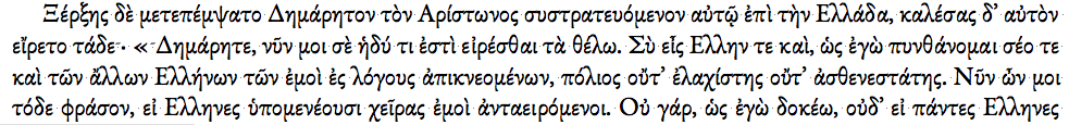
Here are samples of the first few lines of Herodotus' text using different fonts, to help you see how each one deals with the Greek capital letters' kerning and spacing issues. First the two Adobe fonts, which I deem problematic. Then three widely used Unicode fonts with polytonic Greek support, which behave properly from my point of view.
Garamond Premier Pro, which does not look quite right, as shown in InDesign:

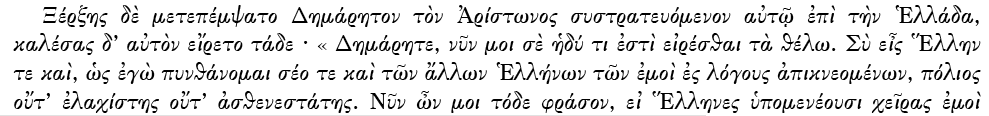
In Microsoft Word, using Garamond Premier Pro, the diacritical marks disappear and indeed the word spacing is perfect, except the Greek is now full of spelling errors of the worst kind:
Using Minion Pro, the word spacing looks even worse than with Garamond Premier Pro as soon as an accented Greek capital letter comes into play:

But at least, when using Minion Pro in Microsoft Word, one can still see the diacritical marks:

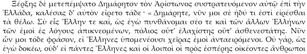
The next sample uses Ralph Hancock's Vusillus, a beautiful font, which separates the glyphs properly for the reader:
Here is the same sample, but as shown in Microsoft Word, using Mac OS X's text rendering engine as opposed to InDesign's, and aligned left:

Now Apple's Times, shown in InDesign:

Followed by Apple's Times, shown in Microsoft Word:

Last, Microsoft's Palatino Linotype, shown in InDesign :
And Microsoft's Palatino Linotype, shown in Microsoft Word:

As you can see, even if the Adobe fonts may be «correct» from a technical and optical standpoint, they are not quite «right» when one tries to read the text. Indeed, one needs better and clearer separations between the words for the text to be legible when accented capital letters are involved.
Moreover, small letters are not entirely immune either. Here is another screen capture of InDesign CS2 showing a sentence taken from Demosthenes' In Midiam. As you can see the last word, «Hoi(a)», being elided, has its diacritical marks almost merged with the elision mark when using the default kerning value provided by the font:
![]()
Here is the same sentence where the kerning has been modified to separate the two glyphs:
![]()
Last, the same sentence in Microsoft Word. Even if it sounds like heresy, to my eyes, the kerning looks better here than when using the default value in InDesign CS2:
![]()
While testing the font in InDesign CS2, I've also discovered that it didn't always work properly when one tries to type accented Greek capital letters and even sometimes fails when importing documents into the application:

Using Garamond Premier Pro, the only way to obtain those letters is to insert them via the Glyphs palette or to make sure they are immediately followed by a small letter.
Ironically, the two capital epsilons and the two capital omicrons one can actually type in InDesign CS2 are completely useless glyphs, since those are «short» vowels that can never normally receive a circumflex accent — the mark of a «long» vowel.
I hope this helps clarify the issues at hand.
Having run all those tests, I now really believe the font offers «buggy» support for the Greek Extended set and should be fixed.
It's a beautiful font and it's a shame that the Greek glyphs, which are gorgeous, can't be of more use.
Thank you for taking an interest in this issue.
P.S. Here is the last message I've posted on the Adobe's forum. With Thomas Phinney's help, I think I've been able to properly identify the problem and to offer a solution (I've corrected a few typos and cleaned up a few paragraphs since the original posting):
|
Thomas Phinney wrote: Yes indeed. 2) Have default polytonic accented caps keep their accents. Yes again. One thing that I wand to be clear on: are you saying that the behavior in InDesign is okay, as far as the first cap keeps the accents and the remainder (in an all-caps word) do not? Or is this also a problem? All right! Now I think I understand what this is all about! Are the default glyphs unaccented in order to accommodate switching a word to all-caps or small-caps and not having diacritical marks interfere with the spacing of the letters within the word? If that's the case then let me explain why that should never happen when dealing with classical Greek. And _if_ it does, then it should be treated as the exception, not the rule (i.e. the _default_ glyphs should _never_ be without diacritics). Accents and diacritical marks in classical Greek are a late editorial addition meant to help read the texts: Diacritics' History (Wikipedia) Originally all the letters were capital letters only and carried no diacritical marks at all, nor were the words separated in any way. The "spiritus asper" was the first diacritic "invented" by the Alexandrian scholars, who actually used the letter "H" to indicate its presence. In other words, _if_ one were to write an ancient Greek word in all-caps, one would only use regular _unaccented_ capital letters (the ones in the basic Greek block 0370-03FF), simply leaving out the diacritics. One would/should _never_ apply the all-caps or small-caps _style_ to a word written in minuscules. That would not make sense at all. Just grab any current edition of Sophocles or Euripides in Greek and you'll see that all the characters' names for instance are spelled using _basic_ capital letters _without_ any diacritics. In a nutshell: in classical Greek, "all-caps" means no diacritics at all, i.e. the _basic_ capital letters contained in the basic Greek block (from Alpha 0391 to Omega 03A9). It does _not_ mean accented letters which "lose" their diacritics when turned into capital letters. So, from a technical standpoint, what should happen is this: if a Greek word written in small letters and so displaying diacritics should _by_mistake_ be switched to all-caps or small-caps (remember, that should never happen as one should use regular capital letters in such a case, not accented ones: but I realize that we're talking typography here, so it's easy to imagine a typographer "playing" with styles when designing a page and forgetting or ignoring the rules that apply to ancient Greek), _then_ there should be OpenType instructions stored within the font so that the _unaccented_ "variants" of the accented Greek capital letters are used _in_that_particular_case_. That way the text will look right if switched to "all-caps" or "small_caps", while the operation remains reversible (i.e. remove the all-caps style and the small letters are back _with_ their accents). Which is obviously what you intended to achieve with your original design except you made it the _default_ behavior, instead of a way to handle a very specific and uncommon situation. However, as you can see from my explanation, that substitution (using _unaccented_ capital letters instead of _accented_ ones) should be treated as an exception, not as the _default_ rule as it is now. It's a "worst case" scenario and should not be common at all. [In fact, it should be so uncommon that at first I simply could not understand at all what was happening. However, I can now see why typographers and type-designers might have looked at the issue from a different and purely technical perspective and come up with the solution implemented in Garamond Premier Pro: it's indeed a smart way to handle the issue, as long as it's not used by default.] I've examined the sample you provide on your store: Garamond Premier Pro .pdf Sample The Greek section now makes sense! Indeed if one copies the text from the .pdf and pastes it in TextEdit, the characters' names, which appear in the traditional all-caps style _without_ diacritics in the sample (KRATOS and HPHAISTOS), are now, in TextEdit, "regular" proper nouns, that is, they use a capital kappa and small letters, including an alpha with oxia for Kratos, and an initial _accented_ capital letter for Hephaistos followed by small Greek letters. [Here is a picture showing the "unstyled" text:]
In other words, instead of being written using only basic capital letters, without any diacritics, as they actually _should_ be according to the ancient Greek editorial tradition, they're perfectly correct "minuscule" words switched to use the all-caps style. Which in turn made you design the font to use _unaccented_ Greek capital letters as your default glyphs for _accented_ capital letters! Indeed "ancient Greek is too serious a matter to leave to typographers"! ;-) So to fix that issue you just need to reverse the "default" behavior to use _accented_ capital letters and to substitute _unaccented_ "variants" only if a word written in "minuscules" is switched to all-caps or small-caps. [...] Thank you again for taking the time to answer my question. I think we've clearly identified the problem now, which should make it easier for you to fix it both in your existing fonts (Minion Pro and Garamond Premier Pro) and in your future creations. |
